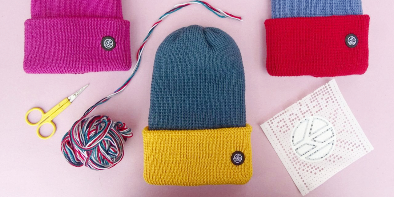
This project was a rebranding exercise, which always has it's own set of challenges. K-nit is a clothing and accessories brand; colourful, fun, predominantly knitwear, with strong ties to the outdoors and adventurer lifestyle. The brief was to adapt the brand image to focus more on the mature, technical aspects of the product range while maintaining their bold use of colour.
To communicate this effectively I decided to rework the brand's logo form.
We call this the 'pin' - a useful and versatile visual icon for the brand that can be used alone, or together with the k-nit logo typeface.
The logo previously used a lowercase typeface that I felt also needed to change. The type maintained some of it's soft, rounded character but took on a much more purposeful and confident persona when used within the product range.

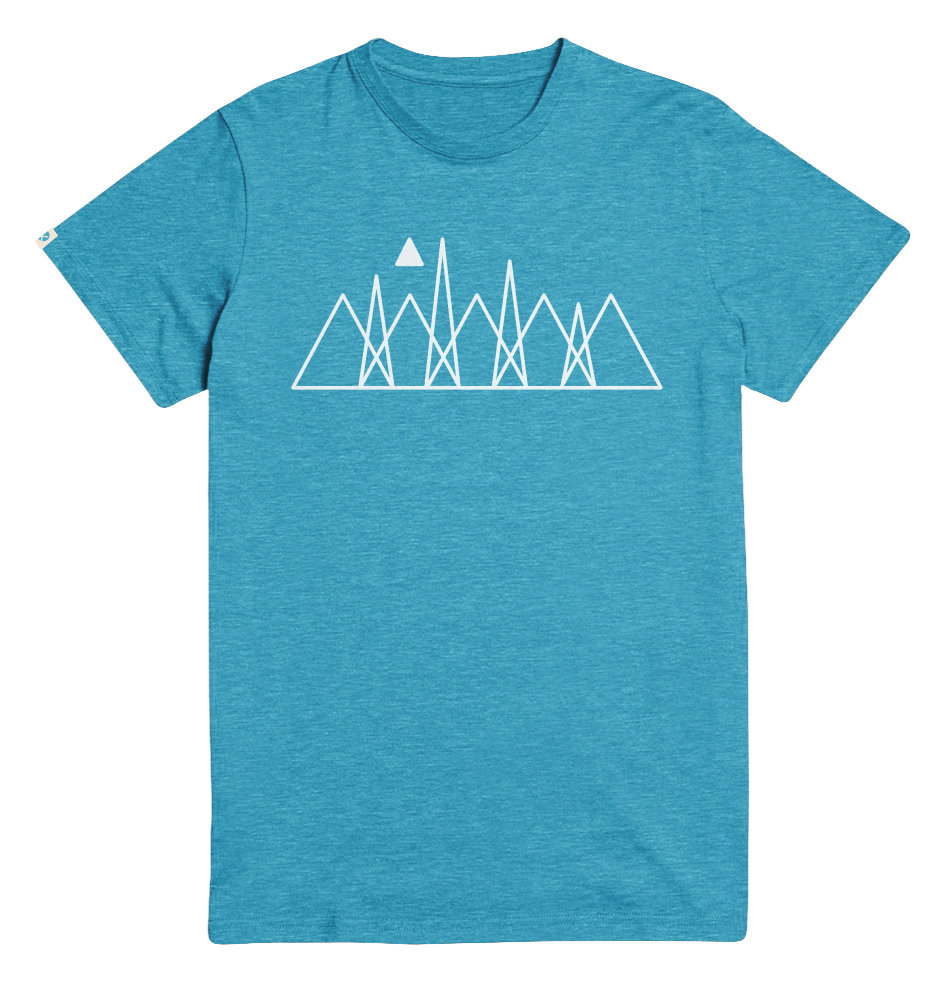
Beyond the rebrand, I was also responsible for providing product designs across a range of products such as t-shirts, sunglasses and baseball caps.